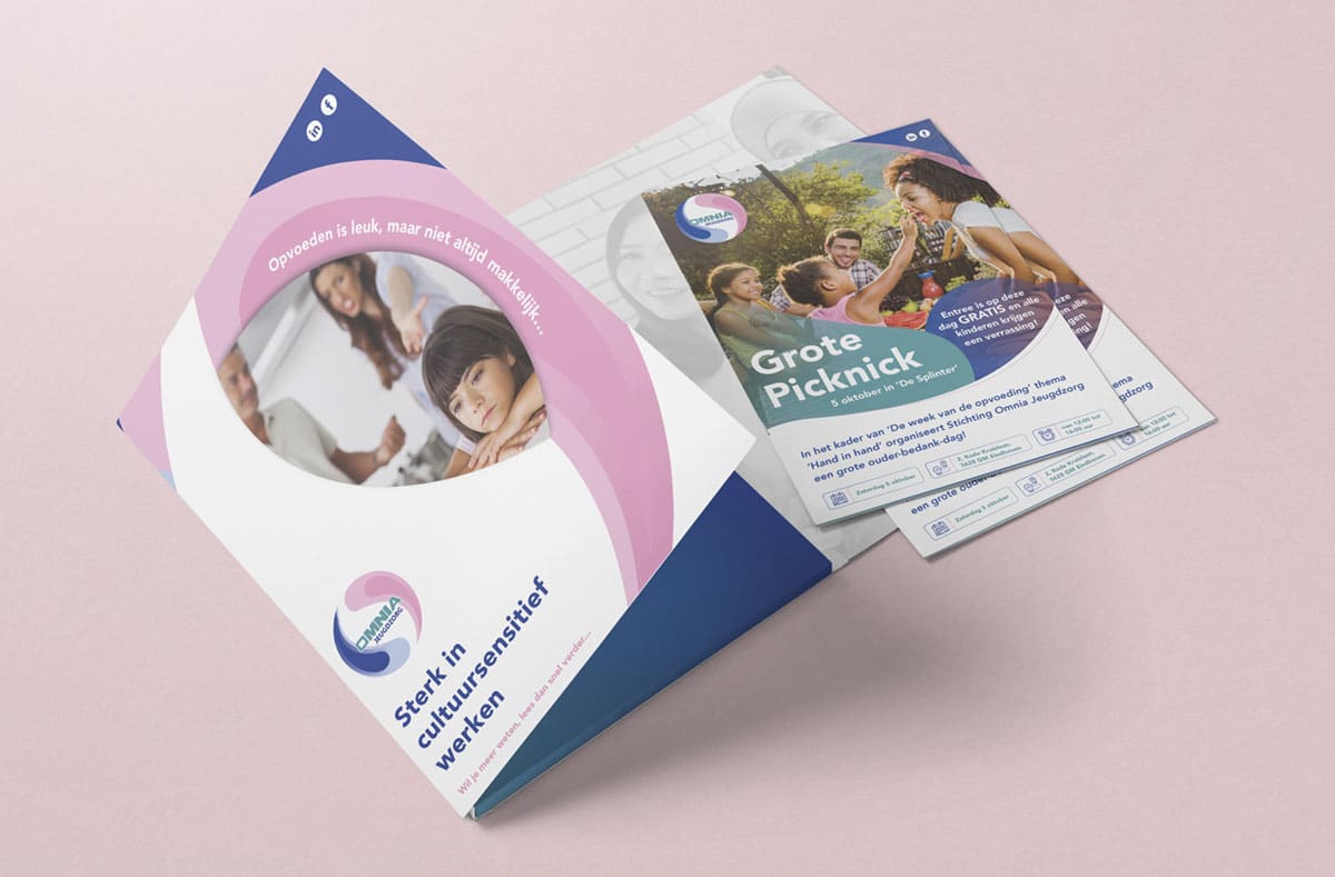
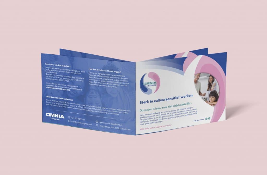
Omnia offers help to families from all cultural backgrounds who have questions about and/or problems with parenting. Their offer consists of training, research (diagnostics), guidance and treatment.
The company logo of Omnia jeugdzorg is derived from the Chinese yin and yang symbol, also, describing how seemingly opposite or contrary forces may actually be complementary, interconnected, and interdependent in the natural world. So, the logo’s idea expresses that the parents’ forces together have a great power effect on raising and educating their child.
In contrast, the brand identity of company is based on two colors; blue and pink. Representing the father and the mother.
Are you also looking for a logo with a good story? Contact us
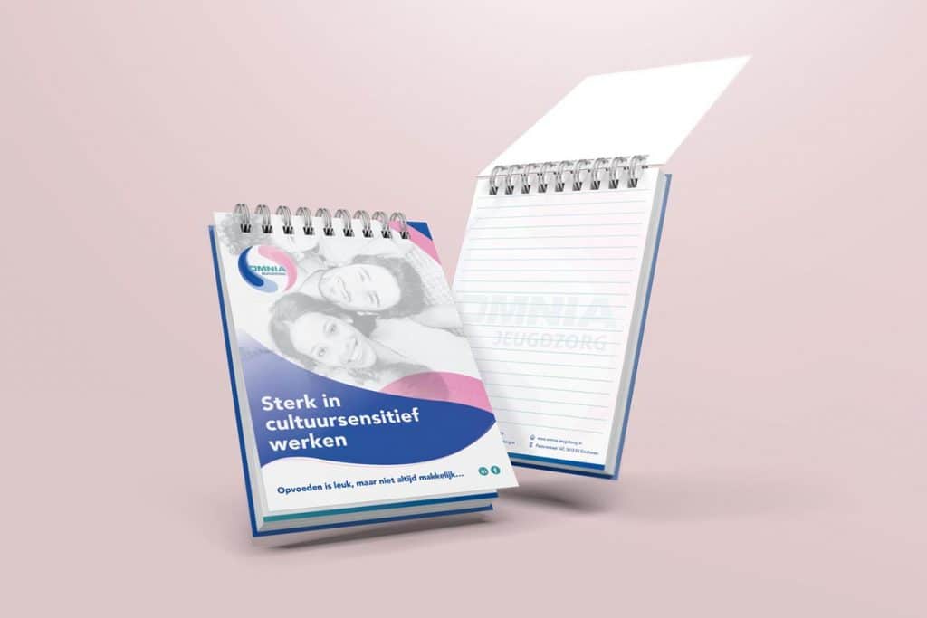
Brand identity
Website / UX Design
Social media
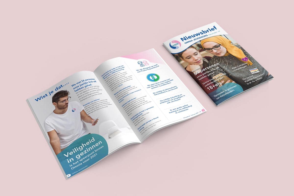
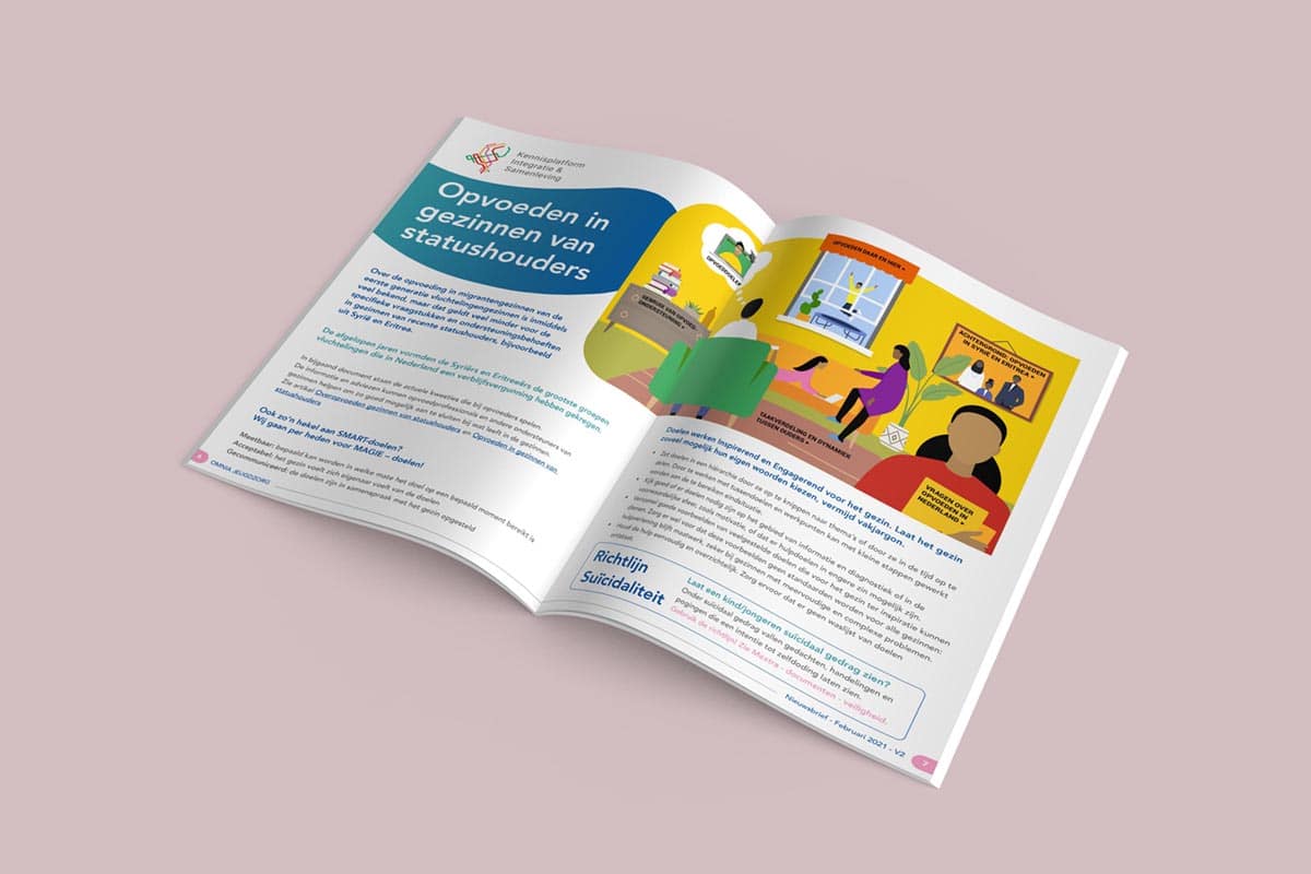
Newsletter design
Icons
Company presentation
Printing and exhibitions
Advertisements
Need a successful project?
If you would like to meet up, talk through a potential project, or find out a little more about what we can do.
We use cookies on our website to give you the most relevant experience by remembering your preferences and repeat visits. By clicking “Accept”, you consent to the use of ALL the cookies.
This website uses cookies to improve your experience while you navigate through the website. Out of these, the cookies that are categorized as necessary are stored on your browser as they are essential for the working of basic functionalities of the website. We also use third-party cookies that help us analyze and understand how you use this website. These cookies will be stored in your browser only with your consent. You also have the option to opt-out of these cookies. But opting out of some of these cookies may affect your browsing experience.
Necessary cookies are absolutely essential for the website to function properly. This category only includes cookies that ensures basic functionalities and security features of the website. These cookies do not store any personal information.
Any cookies that may not be particularly necessary for the website to function and is used specifically to collect user personal data via analytics, ads, other embedded contents are termed as non-necessary cookies. It is mandatory to procure user consent prior to running these cookies on your website.